To create a well planned out and appropriate Digipak I first had to look towards Digipaks which were already out, in order to see how a successful one looks.
The front cover consists of Florence with a necklace made to look like lungs, this fits in with the them of her album.
The back cover also fits in with this theme, with a diagram of a set of lungs which looks almost as it has been x-rayed. The set of lungs is animated with numbers and the numbers correspond to the songs on the album.
 The back cover also contains, a barcode, copyright information, a website and the production companys involved with making the album.
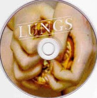
The disk inside the album consists of a pair of hands (which we would assume to be flornce's squeezing something, although we are unsure of the object she is squeezing the feeling is disdinctly unpleasent.
The whole album fits in very well with florence's overall appearance and the themes of her songs.
This will aid to them appealing to her target fanbase, but may not reach a wider audience. However, this may be appropriate as a wider audience may not enjoy her style of music.
This is the digipak from a 6 panelled album by The Killers. The disk inside is made to look like a classic vinyl, this connects with my artists song as one of the lines in 'I wish I was a punk rocker' is 'and vinyl is all that they stocked', this was in reference to the times long gone when everything was carefree. The image of the vinyl reminds people of when music really was all about having a good time and enjoying it. The vinyl in modern society has also become a symbol of those classified as 'Indie', this is appropriate as The Killers and my own target audience would also be considered Indie. The remaining images involve all four band members of The Killers, while the side on the far left involves writing over the picture and the picture in the centre is covered by the CD, the image on the far right is left clear for us to see at all times.
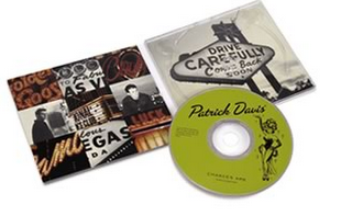
This is the 4 pannelled DigiPak for Patrick Davis. This digipak is simialr to the one I hope to create in that the images used are those which relate to the artists hometown of Las Vegas. The image on the left consists of a collage of random images from Vegas such as hotels and signs. The image on the left of the digipak is a sign similar to the 'Las Vegas' sign. The image on the CD is that of a typical showgirl, which people also tend to associate with Las Vegas. The colours of the Digipak are grey and burnt amber, this is reminiscent of the dry, susty, hot landscape of Las Vegas. I find that this style is very well recieved by those who live within the area but also with those who do not. It also gives some backgroundd information on the artist which may help to increase his fanbase.


No comments:
Post a Comment