Thursday, 25 November 2010

Short list ideas for digipak

As the song chosen for my music video is Sandi Thom's 'I Wish I Was a Punkrocker' I need to put extra thought into my digipac to ensure that it suits the genre of the song and appeals to our audience.

These are examples of the possible fonts I could use as I want to chose a font which looks similar to regular handwriting:


To go with the theme of the song I will need to use colours representative of it, this means using bright colours and earthy tones such as:


I also may use some patterns and prints on my digipak to add greater diversity in the design of the product. To do this I would have to choose carefully as these must fit in with the theme of my song. here are some examples of prints/patterns I could use:


Analysis of advertisements


In order to create an advertisement for my piece, I first had to analyse real adverts that were really out there in the real world.


 This is the infamous poster from The Beatles album Abbey Road. This poster has become very iconic over time and is highly recognisable today. The picture is taken from the front of the album cover. To have an image recognised so globablly through generations is a great achievment.
However, this poster doesn't have any specifications on it at all. From this poster we are unaware of what we are even looking at. While this worked for The Beatles who like my artist are both from britain and would fit into a similar sounding 'pop culture' genre, they were known at the time. A poster like this would not be suitable for my artist, as she is currently unknown.


This advertisement was found in a magazine and is for The Killers album Day and Age. This advertisement offers more than that of The Beatles as it gives the reader more information if they haven't heard of The killers before. for example it clearly states that this is the new album for The Killers and that it will feature a hit single which was earlier released called Human. This advertisement also contains a website in small print which allows for the audience to search around for more information on this album.
This band is like my artist as they both would be considered within the indi/pop genre.


This is a billboard image advertising Jack Johnson's new album To The Sea. In my opinion this is the best of all the advertisements I reviewed as it portrays key information. The name of the artist and the title of the album is written in a large, clear font. Also, included on this advertisement that was not included in the others is a date that the album will be coming out on, May 31st. The imagery and the choice of blue colours is associated with that of the albums name, the sea.
This artist is similar to my artist as they are both solo singers who are not part of a band, they also sing folk, which is the genre of my artists main single.

Analysis of digipaks

To create a well planned out and appropriate Digipak I first had to look towards Digipaks which were already out, in order to see how a successful one looks.


 This is the Digipak for the Florence and the Machine album Lungs.
The front cover consists of Florence with a necklace made to look like lungs, this fits in with the them of her album.
The back cover also fits in with this theme, with a diagram of a set of lungs which looks almost as it has been x-rayed. The set of lungs is animated with numbers and the numbers correspond to the songs on the album.
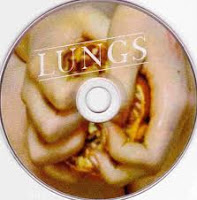
The back cover also contains, a barcode, copyright information, a website and the production companys involved with making the album.
The disk inside the album consists of a pair of hands (which we would assume to be flornce's squeezing something, although we are unsure of the object she is squeezing the feeling is disdinctly unpleasent.
The whole album fits in very well with florence's overall appearance and the themes of her songs.
This will aid to them appealing to her target fanbase, but may not reach a wider audience. However, this may be appropriate as a wider audience may not enjoy her style of music.


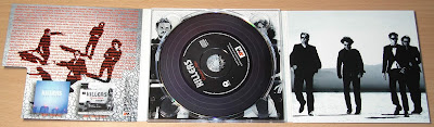
This is the digipak from a 6 panelled album by The Killers. The disk inside is made to look like a classic vinyl, this connects with my artists song as one of the lines in 'I wish I was a punk rocker' is 'and vinyl is all that they stocked', this was in reference to the times long gone when everything was carefree. The image of the vinyl reminds people of when music really was all about having a good time and enjoying it. The vinyl in modern society has also become a symbol of those classified as 'Indie', this is appropriate as The Killers and my own target audience would also be considered Indie. The remaining images involve all four band members of The Killers, while the side on the far left involves writing over the picture and the picture in the centre is covered by the CD, the image on the far right is left clear for us to see at all times.


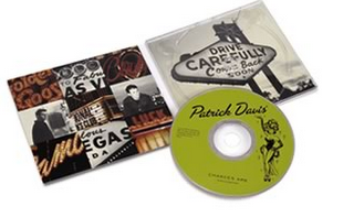
This is the 4 pannelled DigiPak for Patrick Davis. This digipak is simialr to the one I hope to create in that the images used are those which relate to the artists hometown of Las Vegas. The image on the left consists of a collage of random images from Vegas such as hotels and signs. The image on the left of the digipak is a sign similar to the 'Las Vegas' sign. The image on the CD is that of a typical showgirl, which people also tend to associate with Las Vegas. The colours of the Digipak are grey and burnt amber, this is reminiscent of the dry, susty, hot landscape of Las Vegas. I find that this style is very well recieved by those who live within the area but also with those who do not. It also gives some backgroundd information on the artist which may help to increase his fanbase. 


Final Video


Analysis of rough cut

I have chosen this particular scene of our rough cut, the opening sequence, to analyse.


I have chosen this scene to analyse as I feel that it is a very important scene for the context of our music video. We need to add in shots that we re-filmed so that the narrative of our video is made clear for the audience and so that they understand that the rest of the music video is in fact what the singer dreams and is not reality.

We also need to add some sort of filter or affect to the opening sequence so that it is made clear to our audience the difference between what is really happening and what is being dreamed.

We then need to shorten our opening sequence as we focus on the news video for longer than necessary.

Analysing past students work

Alex, Chris, Claudia & Grace from 283goswell on Vimeo.

Watching this groups work from last year shows the different types of shots I want to show in my groups video. The students who composed this video have used well misc en scene as it matches with the music very well. The narrative of the music works well as the character shows her happiness through her facial expression.

Monday, 22 November 2010

Feedback from the rough cut

While the video is coming together and is much better than our very first try (which we had to go back and re-film). However, we still need to add in some more shots which we re-filmed that really help to put context into our video and show that the singer is in facet dreaming about going out into the world and helping people and is not physically doing so.

We will also need to shorten our opening sequence one the extra shots have been put in place as the opening before the song starts is far too long, to do this we will cut down our shots as much as possible while making sure our video still remains in context and fluid.

We then need to think about a possible filter or affect we can apply to the opening and end sequence of music video (the parts which really give our video context) so that the audience is aware of the difference between reality and the singer's dream. We then need to add transitions to make the video more fluid.

Apart from that we also need to go back and make sure that we use a variety of shots, that song is synced all the way throughout and we are using the best shots we have.