Thursday, 16 December 2010
Wednesday, 8 December 2010
Audience Feedback
We were shown our music video on the big screen today :) The following video shows the audience reaction when watching our Music Video
This is the feedback our group got after the cinema showing
Analysing Digipaks & Advertisements
Unfortunately I couldn't find Digipak I have insted analysed CD packs as I will be doing a 4 sided Digipak.
Photos For My Digipak
The following pictures are the one's I will be using for my digipak. Thinking about the Do's and Don'ts list I came up with these
Tuesday, 7 December 2010
Do's & Don't
The following points are to make sure I DO when making my digipak and advert:
 To use a clear font
- Use appropriate sizes for Images and Font
- Use clear photos that are in focus
- Use photos that are an approriate shape for the page
- Use a layout that follows the rule of thirds for composition
- Use an appropriate type face that follows Genre Conventions and A House Style
- To be aware of where I will place the font, it must follow Genre Conventions and to Be Clear From A Distance
- Follow the conventions of the 3 colour rule and use colour that is appropriate for Images, Font and Background
- Think carefully about how I will use and intergrate Font, Text, language and Image
- Use appropriate industry logos and conventions, properly positioned Barcode Date Copyright Titles and Artist Name
IMPORTANTLY I SHOUDN'T :
- Stretch images, this will make them out of focus
- Use layer styles
- Use unnecessary effects. Any effects used MUST suit the genre
- Place text across the artist's face
- Use a font simply because you 'like it'
- Feel you need a seperate photo on every panel BE CREATIVE
Monday, 6 December 2010
Mock Of Digipak
This is the a draft of how I've planned for my digipak to be
The Front is a long shot of the artist -->
<-- The Back, a close-up of the artist works well as the songs will be on the back. As it identifies the artist with the audience, making her more recognizable.
A simple image of a flower is all i really need as the CD will be placed here -->
 <--- The inside of the CD, I have used an image of a landscape because there will be more writing than any if the other sides of the digipak I wanted an image where there's not a lot of things going on. This image suits the genre as its in the open, nature, river, snow etc.
The Front is a long shot of the artist -->
<-- The Back, a close-up of the artist works well as the songs will be on the back. As it identifies the artist with the audience, making her more recognizable.
A simple image of a flower is all i really need as the CD will be placed here -->
 <--- The inside of the CD, I have used an image of a landscape because there will be more writing than any if the other sides of the digipak I wanted an image where there's not a lot of things going on. This image suits the genre as its in the open, nature, river, snow etc.
 I hope by the end of my finished Digipak has a connotation with the genre of the artist.
Thursday, 2 December 2010
Evaluation
In what way does your media product use, develop or challenge forms and conventions of real media products?
In the making of my music video i used real media products to help me gain inspiration to use to make my video. one music video that helped influence the idea for my video is The Verve - Bittersweet symphony. The general theme to the video helped me to decide what my video will actually contain. Bittersweet symphony features a man walking down a road, bumping into people who react very negatively to him, although he carries on as if he does not realise people are even there. My music video features a similar idea, from which melody ( the artist) is walking through the streets of Camden trying to help people and promote peace, although this angers people who feel as if they didn't get what they expected, or why it is that a random person is involving themselves in their life's. However melody still carries on cheerfully singing and helping people, even when she is being shouted at, which helps also to portray the message that the song carries, in society nowadays nobody cares about anybody, other than themselves and people are too money obsessed and materialistic, whilst the artist wishes she could go back to the 60's and 70's when people cared more about music and being happy, rather than solely being media obsessed and money motivated.
here are screen grabs from bittersweet symphony and my music video. the images i have taken from both videos are the aspects of both videos that are similar and help to show how i used ideas from this real music video to help create my music video, using the same interaction idea.
These are the screen grabs from the verve
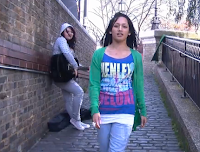


These are the screen grabs from my music video
My product also develops and uses forms of real media products from the same genre which is indie pop. our mise en scene is urban and quite indie, being filmed in Camden town, which is a punky/indie area. we use lots of colourful costumes for our artist along with the scenery. my advertisement and digipak also fits in with others from the same genre as most of them are quite colourful and place the artist on the covers. for my digipak and advertisement i used a black and white theme, with the artist wearing bright colours, and a yellow theme for borders and titles, which fits the indie, colourful theme.
Another real media product that our media product uses and was influenced by was Natasha Bedingfield's video unwritten. This is because its uses a wide variety of camera work, which is what i tried to do in my music video.
Link to video. (I was not able to embed this video YouTube does not allow this due to copyright)
.http://www.youtube.com/watch?v=Dg_7TL5PAzA
How effective is the combination of your main product (video) and ancillary texts ( digipak and advertisement)?
My main product and my ancillary text effectively makes clear links between the two. The music video and the images that were used for the advertisement were both taken in the same area and have the same mise en scene and colour schemes. The image used for the digipak and advertisement is the same, which again is a link between two of my products and also features in the video.
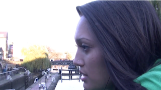
The image of the lion at this part of the video is the same lion i used in my digipak on the inside cover.
The Bridge in the background of this part of the video is the same bridge in the background of the digipak front and back cover, along with the advertisement. Also the area behind melody where all the seats are is where this image was taken.
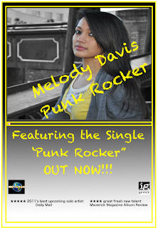
Many other artists do this. for example Rhianna's video only girl in the world, features the same mise en scene as in the video, used on her digipak.
Rhianna's advertisement
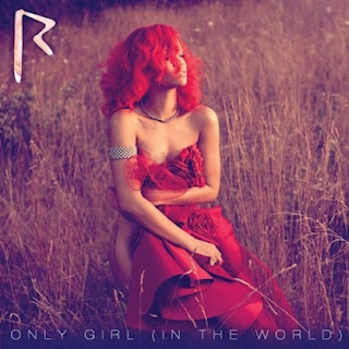
Looking at Rhianna's album cover, advertisement and music video, we can see she has used the same brown and red colour scheme throughout both. We can also see clear visual links for example Rhianna being in a field in her advertisement, which is the same field she is in in the beginning of her video, which helps the audience to link the two products. So while making my media products i followed the same colour scheme linking ideas, along with the same locations.
Rhianna's album cover
I also think my target audience will be attracted to my ancillary products after seeing my music video. The song is about a girl who grew up in present day society, although she sings about how the past (60's and 70's) was a better time, as everyone was nicer, cared about each other more and was less media obsessed. The artist however is a very happy and upbeat person, and using the mise on scene in the video it is portrayed that she is the only person who is caring, whilst nobody else cares. I also portrayed this in my ancillary products as i used photo shop to make the images used on the front cover into black and white to show how dark and miserable society is today, according to the artist, whilst keeping the artist in colour, and enhancing the brightness of the artist to portray that although society is miserable, she is still happy and colourful.
How did you use media technologies in the construction and research, planning and evaluation stages?
Throughout the Creation of my music video , digipak
To Construct my Video and ancillary products i used technologies such as :

In the Researching stages before i created my media products i used technologies such as
In the planning stages i used
In the Evaluation stages i used
What have you learned from your audience feedback?
I did a video blog to talk about what i learned from my audience feedback
In the making of my music video i used real media products to help me gain inspiration to use to make my video. one music video that helped influence the idea for my video is The Verve - Bittersweet symphony. The general theme to the video helped me to decide what my video will actually contain. Bittersweet symphony features a man walking down a road, bumping into people who react very negatively to him, although he carries on as if he does not realise people are even there. My music video features a similar idea, from which melody ( the artist) is walking through the streets of Camden trying to help people and promote peace, although this angers people who feel as if they didn't get what they expected, or why it is that a random person is involving themselves in their life's. However melody still carries on cheerfully singing and helping people, even when she is being shouted at, which helps also to portray the message that the song carries, in society nowadays nobody cares about anybody, other than themselves and people are too money obsessed and materialistic, whilst the artist wishes she could go back to the 60's and 70's when people cared more about music and being happy, rather than solely being media obsessed and money motivated.
here are screen grabs from bittersweet symphony and my music video. the images i have taken from both videos are the aspects of both videos that are similar and help to show how i used ideas from this real music video to help create my music video, using the same interaction idea.
These are the screen grabs from the verve


These are the screen grabs from my music video
My product also develops and uses forms of real media products from the same genre which is indie pop. our mise en scene is urban and quite indie, being filmed in Camden town, which is a punky/indie area. we use lots of colourful costumes for our artist along with the scenery. my advertisement and digipak also fits in with others from the same genre as most of them are quite colourful and place the artist on the covers. for my digipak and advertisement i used a black and white theme, with the artist wearing bright colours, and a yellow theme for borders and titles, which fits the indie, colourful theme.
Another real media product that our media product uses and was influenced by was Natasha Bedingfield's video unwritten. This is because its uses a wide variety of camera work, which is what i tried to do in my music video.
Link to video. (I was not able to embed this video YouTube does not allow this due to copyright)
.http://www.youtube.com/watch?v=Dg_7TL5PAzA
How effective is the combination of your main product (video) and ancillary texts ( digipak and advertisement)?
My main product and my ancillary text effectively makes clear links between the two. The music video and the images that were used for the advertisement were both taken in the same area and have the same mise en scene and colour schemes. The image used for the digipak and advertisement is the same, which again is a link between two of my products and also features in the video.

The image of the lion at this part of the video is the same lion i used in my digipak on the inside cover.
The Bridge in the background of this part of the video is the same bridge in the background of the digipak front and back cover, along with the advertisement. Also the area behind melody where all the seats are is where this image was taken.

Many other artists do this. for example Rhianna's video only girl in the world, features the same mise en scene as in the video, used on her digipak.
Rhianna's advertisement

Looking at Rhianna's album cover, advertisement and music video, we can see she has used the same brown and red colour scheme throughout both. We can also see clear visual links for example Rhianna being in a field in her advertisement, which is the same field she is in in the beginning of her video, which helps the audience to link the two products. So while making my media products i followed the same colour scheme linking ideas, along with the same locations.
Rhianna's album cover
I also think my target audience will be attracted to my ancillary products after seeing my music video. The song is about a girl who grew up in present day society, although she sings about how the past (60's and 70's) was a better time, as everyone was nicer, cared about each other more and was less media obsessed. The artist however is a very happy and upbeat person, and using the mise on scene in the video it is portrayed that she is the only person who is caring, whilst nobody else cares. I also portrayed this in my ancillary products as i used photo shop to make the images used on the front cover into black and white to show how dark and miserable society is today, according to the artist, whilst keeping the artist in colour, and enhancing the brightness of the artist to portray that although society is miserable, she is still happy and colourful.
How did you use media technologies in the construction and research, planning and evaluation stages?
Throughout the Creation of my music video , digipak
To Construct my Video and ancillary products i used technologies such as :
- JVC Video camera - These are the cameras we used in order to film our music videos, and in the planning stage such as the lip sync tutorial.
- Memory cards - Used to store all the data off the camcorders
- Video drives - external hard drive used to store all photos/video clips that we filmed for our music videos
- digital cameras - Took still images for location shots, and for digipak and advertisement photos which were taken in Camden town, the same location as our video was shot.
- Lighting kits - used in the house scene as we wanted more light focusing on our artist.
- Apple Macs- computers used in college to carry out all of our production processes such as editing.
- Final Cut Pro - Final cut pro is the editing program I used in order to put my music video together. This features a time line to lay out my video, a window to view the final product, a window to view the current clip your using, window for all videos available in video drive. Final cut pro has tools such as cutting, muting, speed changing and colour changing option to edit your video.
- Quark - program used to create my digipak, features 2/4/6/8 panel templates for digipaks. Quark is also what I used to create text.
- Photo shop- Used to edit the images to use for advertisement, I airbrushed photos, used tools such as lasso tool and magic wand to cut out a section to remain in colour, whilst I changed the rest of the image to black and white.
Photoshop screen grab and tool bar
- Itunes - used to download the track ' i wish i was a punk rocker- Sandi Thom' which is the song i made a music video to, so i could sync it to my video.
In the Researching stages before i created my media products i used technologies such as
- real artists digipaks - to get a feel for what a typical digipak would look like and what items it would include eg production company's.
- MTV ( For music videos) - TV channel used so i can see other music videos to analyse camera shots, mise en scene, and edits.
- youtube - viewing other music videos
- the internet (mainly google)- researching the genre and artists from the genre
- Vimeo - to see previous a2 music videos
In the planning stages i used
- Digital still cameras - used to take location shots and for animatic
- Microsoft power point - to create mood boards of all technologies used in the creation of my media product.
- Blogger - used to blog about the whole process of creating my media product.
- Microsoft word - used to paste images to so i can print them to use on my mock up advertisement and digipak.
- Final cut pro - used to edit lip sync tutorial
- quark - taught how to use program in a quark tutorial making a mock up digipak
- photo shop - tutorial on how to use photo shop to gain required effects.
- youtube - finding a song i wanted to use.
In the Evaluation stages i used
- blogger - to write about my experiences creating my music video and digipak/advertisement, to add images/links and videos
- youtube - used to add to my blog to show what artists inspired me and how my video relates to real life media products.
- iphone camera - used to create video blog
- vimeo - used so i can watch my music video and take screen grabs
- Microsoft power point - used for mood board.
What have you learned from your audience feedback?
I did a video blog to talk about what i learned from my audience feedback
Here is a link to the previous blog that has my audience feedback uploaded to it:
Mock up of Digipak
This is the mock up for my digipak. Using the mock up i was able to plan the images i wish to use, along with their positioning, any effects i want to add, what type of font i want to use and where it will be places, and the general content of my 4 panel digipak.
 |
| Front and back pannel |
 |
| Inside pannels |
 |
| Front Pannel |
 |
| Back pannel (track listing) |
 |
| Inside left pannel (for lyrics from song) |
 |
| Inside right pannel (for disk) |
Photos i plan to use on my digipak and advertisements
These are the three images i have planned to use for my Digipak. i have decied to go for a black and white theme, with everything besides the artist and the flower to be in colour. This links in with my music video because in the song the artist is singing about how in present day society nobody cares about eachtother, almost describing it to be quite miserable compaired to the old days. the arist however, is a happy upbeat person who, in our video attempts to help people and brighten up their day, where in reality it seems shes the only happy, 'colourful' person.
This is the image i plan to use for my front cover of my digipak and my advertisement
Overviews of Do's and Dont's of design work
Below are a list of all the do's and donts to follow while creating the digipak and magazine adverts for our music video projects.
Do's
- Use a clear font
- Use appropiate sizes for images and font
- Use clear photos that are in focus
- Use photos that are an appropriate shape for the page
- Use a layout that follows the rule of thirds for composition
- Make sure the font is clear from a distance
- Follow Genre conventions
- Follow the conventions of the 3 colour rule and use colour that is appropriate for Images, Font, Background
- Use appropriate industry logos and conventions, properly positioned:
Barcode
Date
Copyright
Titles
Artist Name
- Stretch the images, this will make them out of focus
- Use layer styles
- Use unnecessary effects, they must suit the genre
- Place text across the artists face
- Use a font simply because you like it
- feel u need a seperate photo on every panel
Short list of fonts, colours, layouts and design ideas
For My digipak and advertisement I want to use quite bright, colourful colours, along with a mainly black and white background.
The font I have chosen is a chalk board style
The font I have chosen is a chalk board style
Analysis of 3 advertisements that relate to my genre
This is the advertisement for Florence and the machines album 'Lungs'
These are three examples of advertisments that are from the same genre as Sandi thom, and her song i wish i was a punk rocker.
All 3 of these albums feature the picture that was on the front cover of the digipak, so when creating my own advertisement i will use the same front image for both the digipak and the advertisment. These advertisments also feature the same font that was on the orginal digipak, and the same colour scemes. these are all things i will use in my own advertisment so it relates to albums and digipaks from the same genre and both the advertisment and digipak link together.
With many of these advertisments they also say that they feature a song, which maybe their most popular at the time which helps to attract the target markets. when i make my advertisment i will say that it features the song 'punk rocker', which is the song i made a music video to.
This advertisement is for The Killers album Day and Age.
This is 3 of kate nash's advertisements for three of her albums.
Subscribe to:
Comments (Atom)


